Poki Studios
A high-contrast corporate fun shoot across two locations
Photography

Episode 1: The Brief
Poki Studios wanted a team photoshoot that felt nothing like a corporate photoshoot. The ask was high-contrast, fun, and full of personality — images that could live on their website and social media without looking like stock photos.
The challenge: make a team of people look genuinely relaxed and themselves, on a one-day shoot, across two locations, without losing visual consistency.
Episode 2: Location Scouting
Before my camera and lights came out, I spent time with the client exploring locations that could carry the high-contrast, editorial brief. We needed spaces with strong colours, interesting textures, and enough variety to give the final gallery range without looking disjointed.
We shortlisted two locations:
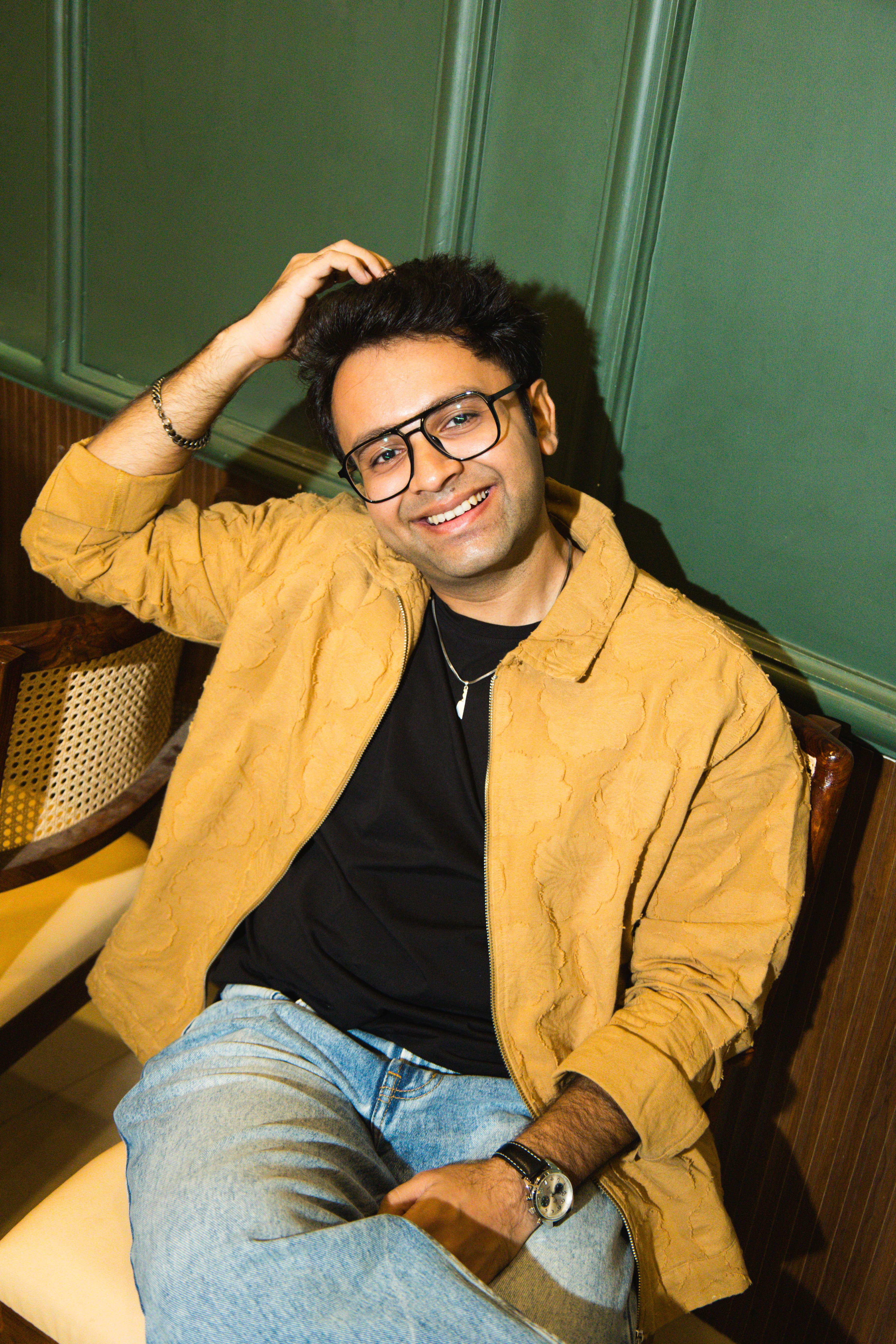
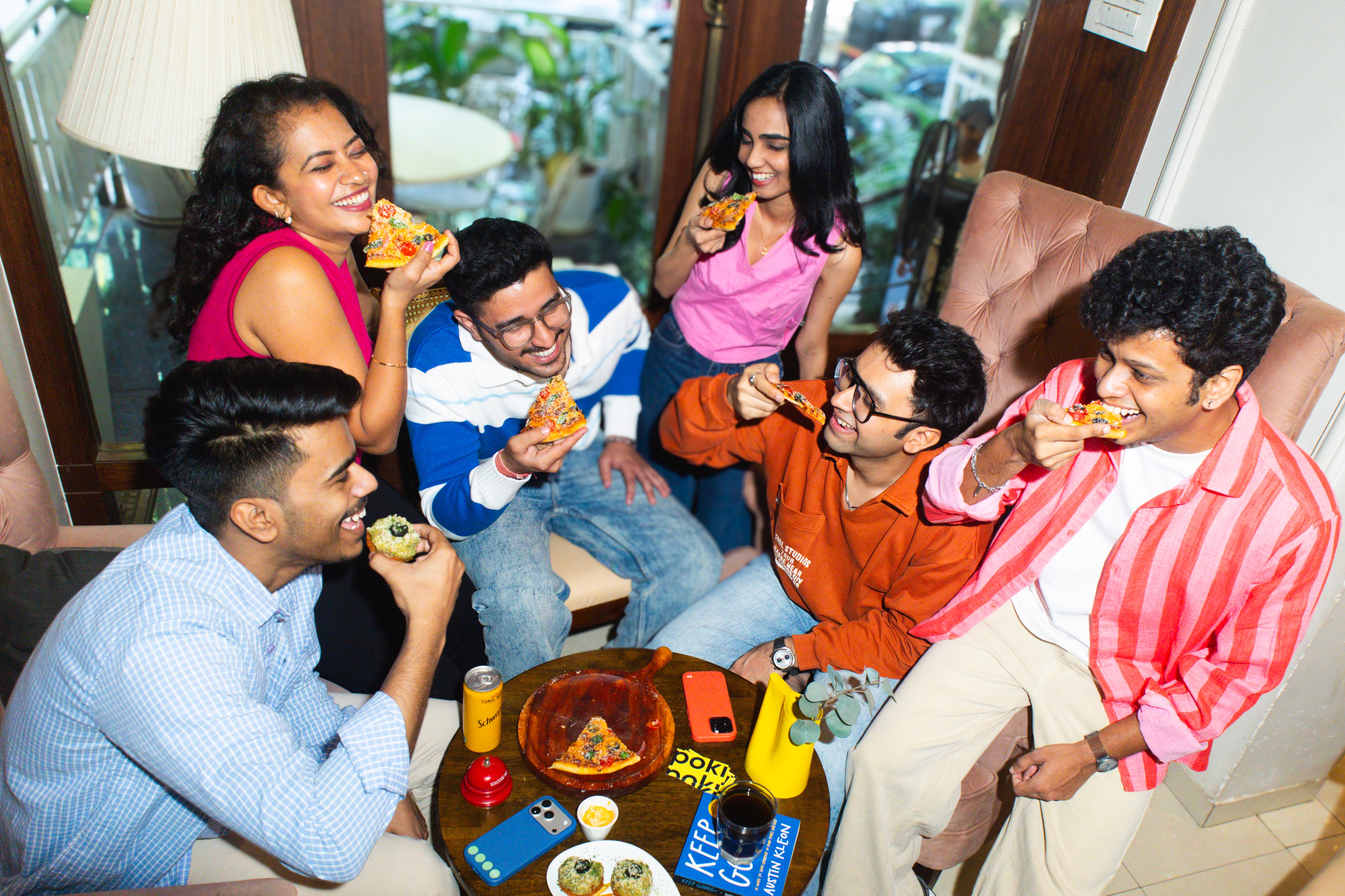
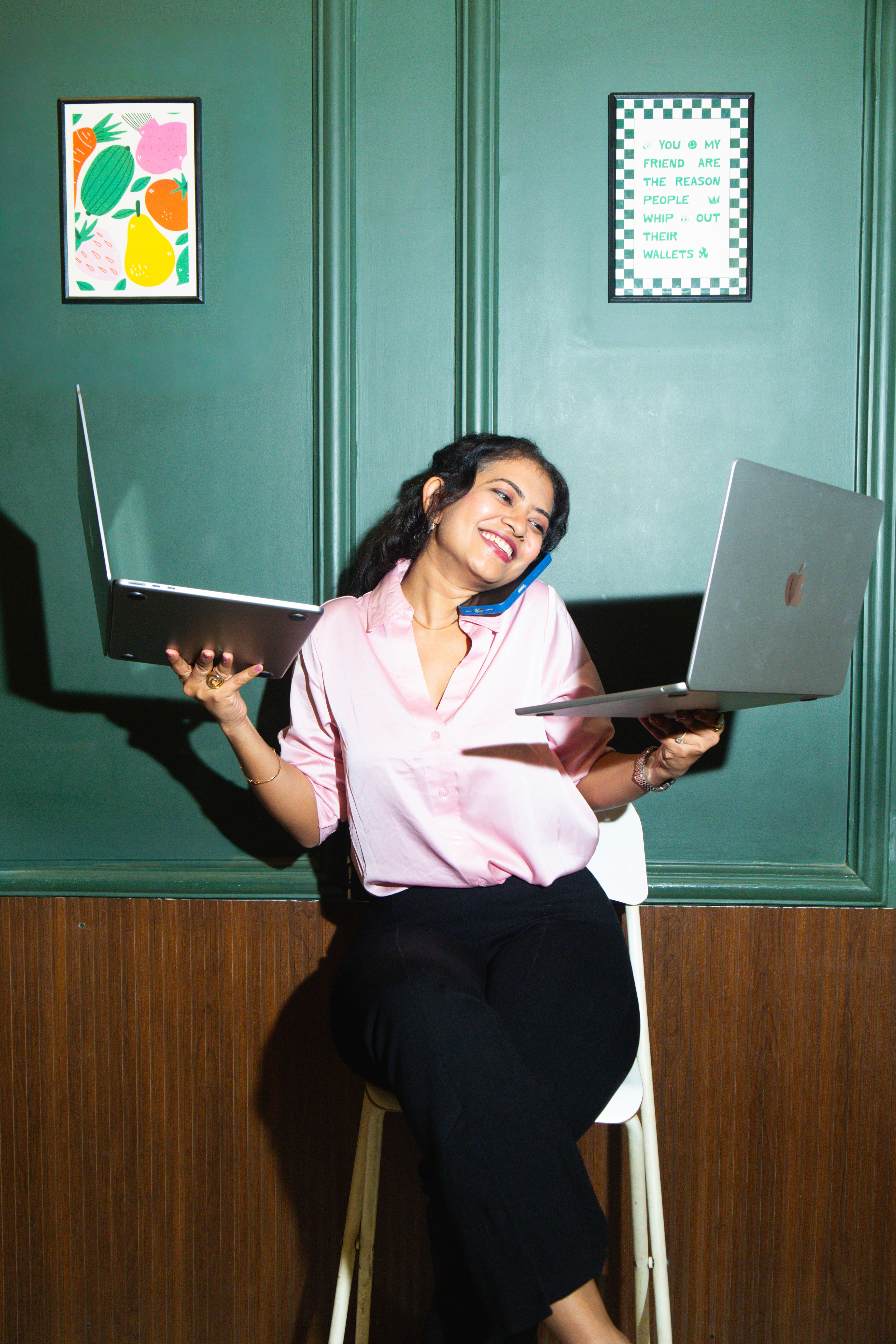
The Cafe - dark green panelled walls, warm ambient light, rattan chairs, art prints.
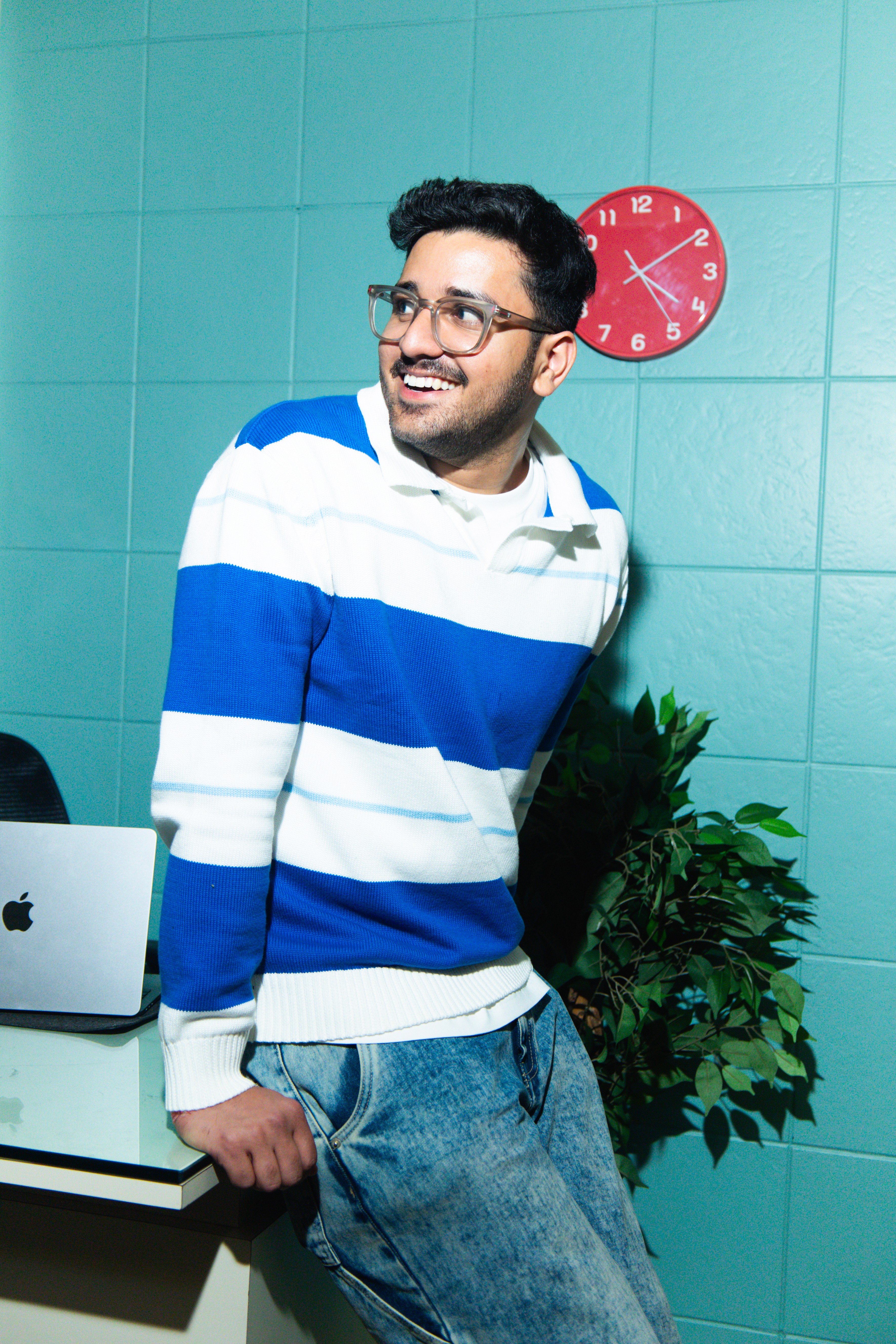
The Office - Poki's own space. Blue tiled walls, a bold blue-and-white checkerboard floor, yellow accents everywhere. Bright, graphic, and completely theirs.
Alongside them, weput together a wardrobe direction for each team member, props (books, laptops, drinks, design objects), and the wall art and hangings that went up in both spaces. Every element in frame was a deliberate choice.
Episode 3: The Lighting
The brief was a high-contrast and harsh shadows aesthetic. I used a Godox flash to create harsh, defined shadows that gave the portraits a punch .
At the cafe, the direct flash played against the dark green panels, creating strong shadow fall-off that made subjects pop. The warm ambient light from the space bled into the edges of frames as a hair/rim light.
At the office, the bright walls and bold colours did a lot of the heavy lifting. The approach shifted to enhancing natural and ambient light rather than overpowering it.
Episode 4: Direction
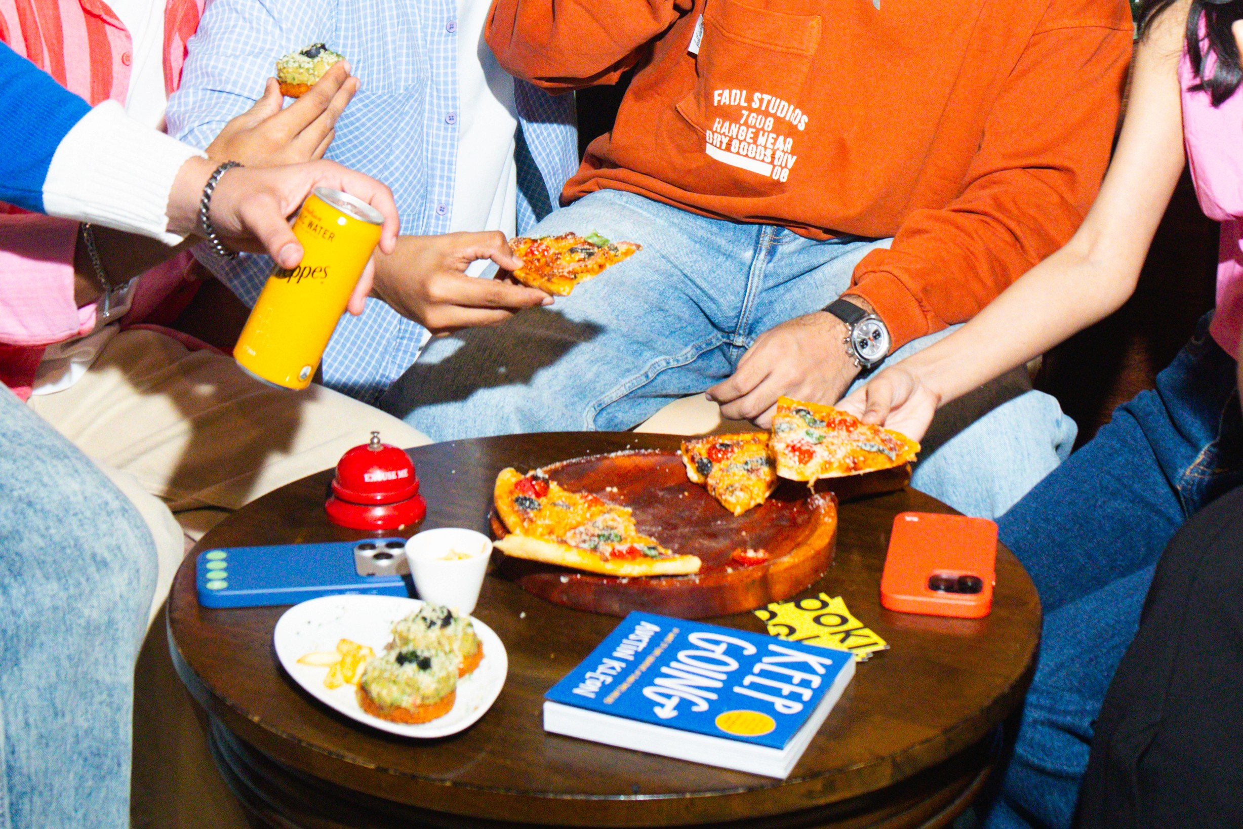
I gave subjects something to do: talk to each other, react to something, look away from the lens. The camera came out while they were mid-laugh, mid-gesture, mid-moment.
For group shots, I choreographed loosely to keep everyone in frame and well-lit, enough freedom for the frame to feel spontaneous. The green wall group shot worked because everyone had a role in the composition, but nobody was standing to attention.
Episode 5: Editing
Post-processing in Lightroom focused on three things:
Color consistency across locations - the cafe's warm greens and the office's cool blues needed a unifying grade so the gallery felt cohesive. I pulled the highlights slightly and pushed contrast to honor the high-contrast brief without making the images feel heavy. I wanted the color to be on the lines of what would it look like if Kodak created a modern film roll.
Skin tones against bold backgrounds - the green wall in particular creates color spill on the shadow side of faces. Each portrait needed individual correction to keep skin tones natural while letting the background stay rich and saturated.
Episode 6: My Learnings
Location is the brief - The two spaces defined the visual language of the whole shoot. Getting the location right before the shoot day made every other decision easier.
Direction is a design problem. Getting natural-looking shots from people who aren't models requires the same thinking as UX. You create the conditions for the right behavior to happen, rather than forcing it.